Where do People Consume the Most and Least Calories
This map shows data on kilocalories available for consumption on average per person per day in 174 countries based on data from the Food and Agriculture Organization (FAO) Statistics Division. Consumption does not equal actual caloric intake since a portion of food is wasted, see the definition of FAO:
The food consumption refers to the amount of food available for human consumption as estimated by the FAO Food Balance Sheets. However the actual food consumption may be lower than the quantity shown as food availability depending on the magnitude of wastage and losses of food in the household, e.g. during storage, in preparation and cooking, as plate-waste or quantities fed to domestic animals and pets, thrown or given away.
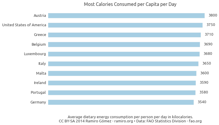
As of the most recent data for 2006-08 most calories are consumed in Austria followed by the USA, Greece, Belgium and Luxembourg.

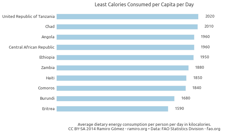
Unsurprisingly, the top 10 countries where the least calories are consumed are all in Africa, except for Haiti.

Although hunger has been reduced substantially since 1990, hunger and consumption of poor-quality food ("hidden hunger") are still huge problems. See the newly released Global Hunger Index for more information.
While many people in developing countries do not get enough (good) food, bad diets are also a big problem in developed countries, where many people consume more calories than they expend, leading to overweight and obesity.
Using the Map
You can see the data value for an individual geographic unit (e .g. country, state, county) by moving the mouse over it.
You can zoom in by clicking on a unit and zoom out by clicking on the same unit or any point on the map outside of units.
Click on the button in the top menu to see the IPython notebook with the code to retrieve and process the data.
Click on the button in the top menu to see the data table used for the maps.
Click on the button to download the currently displayed map as a PNG image.
If you see in the top menu you can choose a color scheme from the drop down displayed on click.
If there is a menu item named Choose Dataset on the left in the top menu, you can choose different data series to display on the map from that drop down.
Credits
This map is created using the d3.geomap JavaScript library.
Published October 14, 2014 •
Data Source •
CC BY-SA 2014 Ramiro Gómez (@yaph)