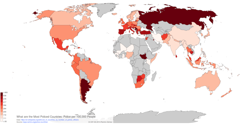
Data on Policemen per Country and Population
IPython Notebook to retrieve, cleanup, display and plot data on number of policemen and their population ratio for over 100 countries from Wikipedia.
In [1]:
import requests
import io
import re

import pandas as pd
import geonamescache

from geonamescache import mappings

gc = geonamescache.GeonamesCache()
cnames = gc.get_countries_by_names()

url = 'http://wikitables.geeksta.net/dl/?url=https%3A%2F%2Fen.wikipedia.org%2Fwiki%2FList_of_countries_by_number_of_police_officers&idx=0'

re_num = re.compile(r'^[\d,.]+$')

def fix_num(x):
    if (isinstance(x, str) and re.search(re_num, x)):
        x = x.replace(',', '')
        if '.' in x:
            x = float(x)
        else:
            x = int(x)
    return x
Get and cleanup data
Convert number strings to floats or integers, remove trailing numbers (footnotes) from country names and replace country names with those used in geonamescache. Also add an iso3 column for rendering the d3 based map.
In [2]:
csv = requests.get(url).text
df = pd.read_csv(io.StringIO(csv))
df = df.applymap(fix_num)

num = ''.join([str(i) for i in range(10)])
df['Country'] = df['Country'].apply(lambda x: x.rstrip(num))
df['Country'] = df['Country'].apply(lambda x: mappings.country_names.get(x, x))
df['iso3'] = df['Country'].apply(lambda x: cnames[x]['iso3'])
df.set_index('Country', inplace=True)
df.head()
Out[2]:
Display and plot most and least policed countries
First set some common plotting properties.
In [3]:
footer = 'CC BY-SA 2014 Ramiro Gómez - ramiro.org • Data: en.wikipedia.org/wiki/List_of_countries_by_number_of_police_officers'
mpl.rcParams['font.size'] = 11
mpl.rcParams['font.family'] = 'Ubuntu'
mpl.rcParams['axes.color_cycle'] = 'a6cee3, 1f78b4, b2df8a, 33a02c, fb9a99, e31a1c, fdbf6f, ff7f00, cab2d6'
Show most policed countries
In [4]:
df.sort('Police per 100,000 people', inplace=True)
df.tail(10)
Out[4]:
Plot most policed countries
In [5]:
info = 'Number of policemen by 100,000 people.\n'

s = df['Police per 100,000 people'][-10:]
s.plot(kind='barh', figsize=(10, 6), title='Most Policed Countries\n', fontsize='large')

ax = plt.axes()
ax.spines['top'].set_visible(False)
ax.spines['right'].set_visible(False)
ax.spines['bottom'].set_visible(False)
ax.spines['left'].set_color((1, 1, 1))
ax.xaxis.set_label_text(info + footer)
ax.xaxis.set_ticklabels('')
ax.yaxis.set_label_text('')

for i, x in enumerate(s):
    ax.text(x + 100, i - .1, x, ha='left', fontsize='large')

plt.savefig('../static/img/graphs/most-policed-countries.png', bbox_inches='tight')

Show least policed countries
In [6]:
df.head(10)
Out[6]:
Plot least policed countries
In [7]:
info = 'Number of policemen by 100,000 people.\n'

s = df['Police per 100,000 people'][:10]
s.plot(kind='barh', figsize=(10, 6), title='Least Policed Countries\n', fontsize='large')

ax = plt.axes()
ax.spines['top'].set_visible(False)
ax.spines['right'].set_visible(False)
ax.spines['bottom'].set_visible(False)
ax.spines['left'].set_color((1, 1, 1))
ax.xaxis.set_label_text(info + footer)
ax.xaxis.set_ticklabels('')
ax.yaxis.set_label_text('')

for i, x in enumerate(s):
    ax.text(x + 1, i - .1, x, ha='left', fontsize='large')

plt.savefig('../static/img/graphs/least-policed-countries.png', bbox_inches='tight')

In [8]:
df.columns = ['Size', 'Year', 'Police per 100,000 People', 'iso3']
df.to_csv('../static/data/csv/police-countries.csv', encoding='utf-8', index=False)
Volcano Map Poster
Recommended Books

IPython Interactive Computing and Visualization Cookbook

Python for Data Analysis: Data Wrangling with Pandas, NumPy, and IPython

Python Data Visualization Cookbook
Links to Amazon and Zazzle are associate links, for more info see the disclosure.

About this post
This post was written by Ramiro Gómez (@yaph) and published on October 06, 2014.
blog comments powered by Disqus