What are the Most Policed Countries: Police per 100,000 People
This map shows data on police personnel per 100,000 population of 131 countries and dependencies. The numbers were published between 2000 and 2014 and many countries are missing, especially in Africa, Western Asia, countries that belonged to Russia and as usual North Korea.
The scale is deliberately capped at 600 policemen per 100,000 people, though there are some countries with larger rates, most notably Vatican with a ridiculously high ratio of 15,625, which translates to 130 policemen in total since it is a very small country. The other countries in the top 10 shown below are also very small:
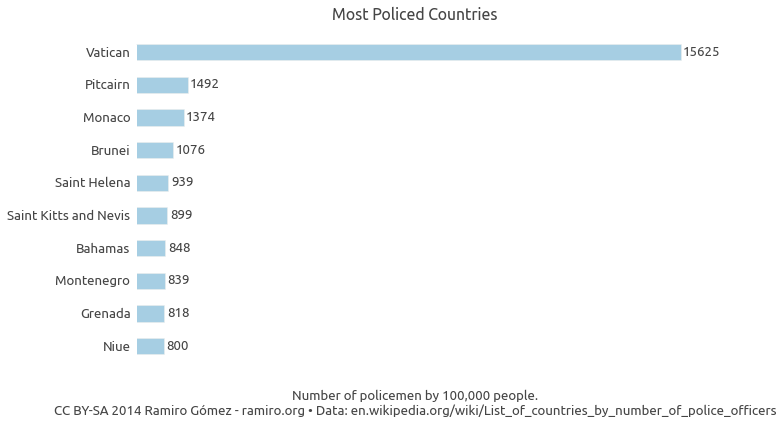
The biggest surprise looking at larger countries to me is Spain with a ratio of 511 it is not very far behind Russia with 546, and Argentina's ratio is even higher with 558.
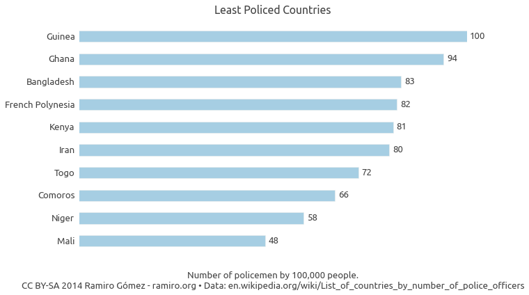
On the lower end we have countries with 100 and less policemen per 100,000 people, most of which are in Africa with Mali having the lowest ratio with 48.
According to Wikipedia, where I downloaded the data, the United Nations recommends a minimum police strength of 222 per 100,000 people, but I couldn't find that number in the UN report [PDF] the data was extracted from.
It is also worth noting that police in one country may mean something different than police in another country, the UN report states the following regarding possible differences and caveats:
Attempting to measure the total police personnel with only one value, one has to keep in mind the shortcomings of such an approach: The police force is not a monolithic entity with similar structures and tasks all over the world. There are several types of police forces that might exist in one country, but not in another. Also, the tasks executed by the police may differ between countries. Thus, figures might include (or not include) data on criminal police, traffic police, border police, gendarmerie, uniformed police, city guard or municipal police, but also customs officers, tax police, military police, secret service police, police reserves, cadet police officers or court police. Apart from this, the way of counting personnel might differ (e.g. heads vs. budget posts, which will make a difference when counting part-time personnel). Therefore, comparability could be considered fairly weak.
Keep this in mind when interpreting the results.
Using the Map
You can see the data value for an individual geographic unit (e .g. country, state, county) by moving the mouse over it.
You can zoom in by clicking on a unit and zoom out by clicking on the same unit or any point on the map outside of units.
Click on the button in the top menu to see the IPython notebook with the code to retrieve and process the data.
Click on the button in the top menu to see the data table used for the maps.
Click on the button to download the currently displayed map as a PNG image.
If you see in the top menu you can choose a color scheme from the drop down displayed on click.
If there is a menu item named Choose Dataset on the left in the top menu, you can choose different data series to display on the map from that drop down.
Credits
This map is created using the d3.geomap JavaScript library.
Published October 06, 2014 •
Data Source •
CC BY-SA 2014 Ramiro Gómez (@yaph)